
Delivering products and services targeted to seniors is a reality of our times and something that will involve more in the near future.
We are living longer, with that comes more health issues. Naturally we will try to remain on our jobs, in the company of our friends and loved ones and staying in familiar places… and hopefully keeping mental and physical health.
One of the great things of User Research with seniors is that they provide extreme, out of the boundaries insights, away from the average Joe, providing a great path for discovering new user needs, tackling pain points. A great place for innovation.
So here is my Christmas UX Research short story:
For Christmas I gave a smartphone to one of my parents, so a few days after I got a call asking what might be a strange question from a previous Android user:
How can I continue after inserting the SIM pin?
The Iphone user, me… replied: You only have to insert the Pin or maybe there is an ok/next/confirm bottom below the keypad
I got a strange answer: No it doesn’t work. There is only a back button. I don’t what to lock the SIM.
Surprisingly this a simple, tested over and interaction but still failed to be used effectively.
What i found was:
- • The keypad has in fact a button. Surprisingly it feels/looks like a back button for someone, not this user.
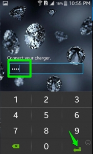
- This user has always been using this interaction with a very similar icon for another purpose. Guess what… To go back.
- Oddly this icon replicates the symbol found on the Return key of a PC keyboard. Also a very long shot for this user!
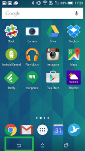
The use of icons without any text context makes me wonder, especially when use and affordance don’t exactly match making users less confident.
Icon lovers and aesthetics freaks always get excited adding just one more visual for the sake of beauty, theirs.
Aesthetics with limited or no value creates unnecessary difficulties for most users and a stigma for the 60+ population.




Leave A Comment